Before I show you my newest project I want to thank each and everyone
that sent their congrats on my Romantic Homes Magazine Feature.
I so appreciate your friendship and your support of my blog. Without
all of you this feature would not have happened.
Thank you!
Lately I have been working on several projects to lighten-up our
house but I only have one completed to show you today.
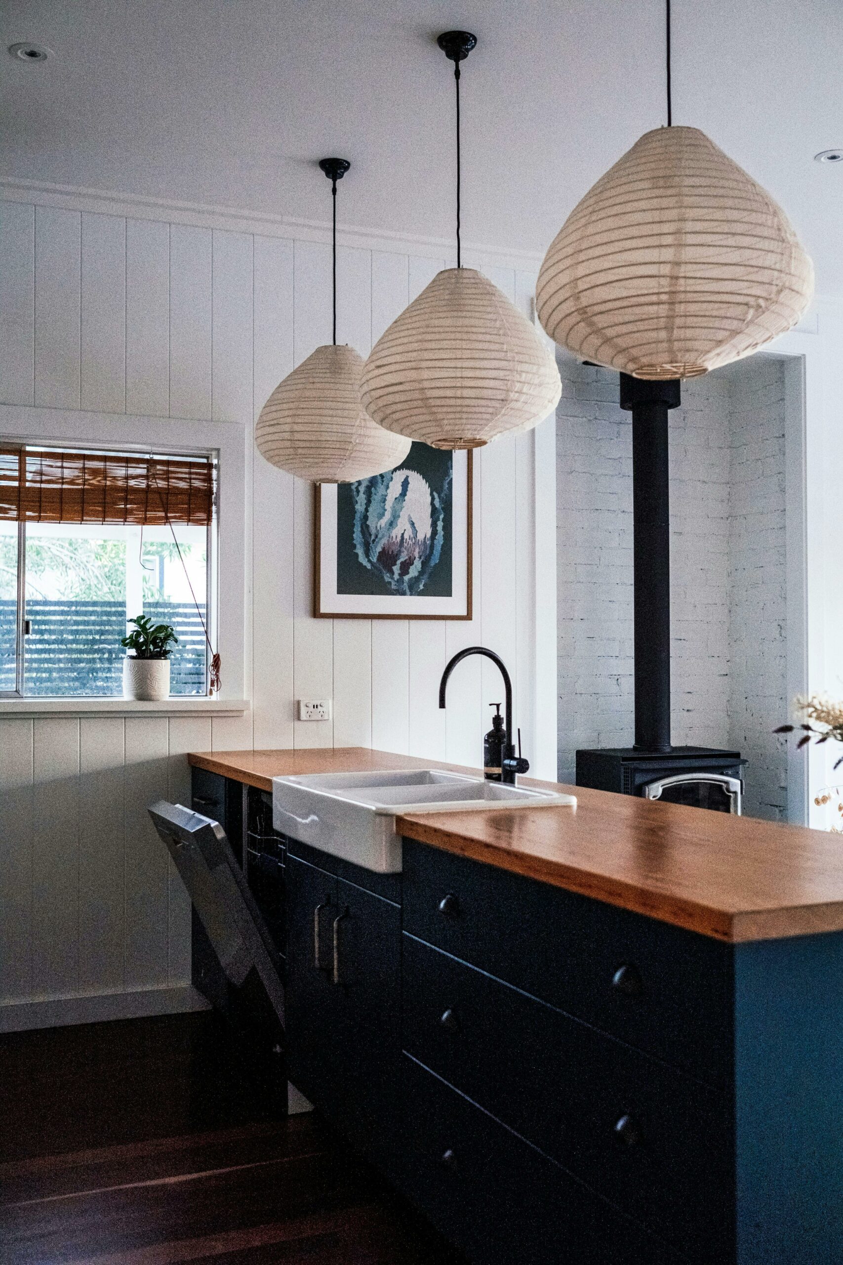
Below is a picture of the family room taken prior to painting.

The darker art work wasn’t going back up so I ordered
original antique french letters from Vintage Paper Attic’s
Etsy shop and then went on the search for frames. Michaels had
some very shiny gold frames I liked and I knew they could
be painted with my DIY Chalk Like Paint.
White craft paint was mixed with calcium carbonate to create the
chalk paint. The frames were painted, distressed and then glazed.
I didn’t want a brown glaze on these so I used a transparent glaze
from Home Depot and added light gray craft paint to it.


I added two 11×14 frames inside a larger frame. Normally
I would add something more to the wall but because of the
new wall paint I’ll probably leave it as is.
If you have been reading my blog lately you already know I
have been trying to lighten-up our decor to sell our home. We
recently had our khaki green family room walls painted
a neutral beige to appeal to more buyers.
Yesterday Steve and I went to the sneak peek of the upcoming
Homearama in our neighborhood. Each home is being professionally
decorated and will be open to the public in late April.
I was totally floored when EACH home we went into had very dark painted
walls in almost every room. Chocolate brown, dark blue and gold were
popular wall colors.
Can you guess what wall color was in every single home
we visited?
Yep….
Khaki green!!

I love both looks Sherry but I guess since spring is come early this year I'm in the mood for some lighter colors too. Your frames came out fantastic, I love that you mixed your own chalk paint from craft paint. Great way to get the exact color you want and a fraction of the cost. Thanks for sharing.
Well at least yours will be unique. I bet everyone prefers the lighter colour
x jeanetteann
Your room looks great in the lighter color. That is funny that the model homes have darker colors. Must be the new trend.
Sherry, I love the lighter look of the walls in your living room. I think it will make your home stand out from the other ones in your area. Thanks so much for showing how to lighten up frames. I have taken on a project to repaint some 12×12 mirrors as centerpiece bases for a wedding reception and your technique looks perfect for the look the bride and her mother want.
The frames are gorgeous.
Love the new wall color and the new prints Sherry! Your home always looks beautiful!!
I think you did the right thing with the lighter wall color….buyers look at neutral and think they won't have to paint to match their furniture etc…funny that the designer homes were all dark colors!
Love the frame project…
Well how bout that? I guess you were kicking yourself for painting over it after seeing it in the model homes. I still like your new color though and it was probably a smart move since you're selling it. Your family room is very pretty. I don't think I've ever seen it before. Love your new "old" letters framed too.
I love the lighter color of your home!
Hi Sherry, I just discovered your blog while looking for a recipe for chalkpaint. I am so excited to have found you, as soon as I got here I knew I was going to enjoy all of it.
Thanks for the blog and for sharing your great style!
The frames within a frame are eye catching without being over the top. I'm leaning toward light in rooms so let's hope purchasers are, too! ~ Maureen
i like both designs. Its a nice change to add the light frames.
I love the way the room looks. I like the frames a lot!
what a great idea! would love to do that with some old family papers.
Your wall colors look great both ways. I really like the look of the pictures frames,Well done.Thanks for sharing.
I really like the frame idea! I am fixing to paint my bedroom and I love the color you chose for the walls. What paint did you use and color name ? Thanks for sharing!
Love your frames…and the wall color looks great!
I find that sometimes decorators try too hard in those showcase houses. They are a little too contrived for me. I like a house, like yours, that has is decorated with objects collected over time or DIYed. Your new color is refreshing and says "Buy me" much more than your previous color.
Love the lighter look. I just redid my living room lighter and am loving the soothing feeling. Hope you are able to sell quickly! I love Homearama too….I get lots of great ideas there always!
Lorraine
Sherry, I love your frames! They look great!! The lighter walls look beautiful in your home; and will appeal to buyers. It's just funny that once we change everything over to one style…the style that we left behind comes back again! LOL!
So much prettier, I like the lighter more neutral version…..fabulous!
When we sold out last house I let all my own personal taste go out the window and repainted everything neutral colors. We also rented a storage unit to put all our "clutter" in so that the house felt larger. It looked like a boring model home by the time I was done. But, the house sold in three days, so I guess all the hard work was worth it? Love the frames within a frame look. And a belated congrats on the Romantic Homes feature!!!!
The frames look beautiful and the wall color is very pretty!
-Shelley
The frames within the frames are scrumptious. Congrats on your magazine feature-my internet was out for a long time last week. hugs, olive
I like your new art work, Sherry! Doesn't it figure ~ you'll see it everywhere now! : ) I think you went the right route though. I think more people will be able to picture there stuff in your home with the neutral color.
Great finish on the frames, Sherry. I like the lighter color in your room.
Oh Sherry, isn't that what every realtor tell you to do, lighten the walls? Then the funny thing is, the first thing the new owner does is PAINT! (Probably Khaki Green!) LOL
I love the way the frames turned out, a little switching up is always fun. Thanks for linking!
Hugs,
Patti
Sherry, Your living room is so beautiful in the "before" picture. I too am lightening up my rooms! Your picture frames came out wonderfully! I have 2 huge wood carved mirrors that I am thinking about painting. If they came out like yours I would be thrilled! LOVELY!
Yvonne
Does it ever, ever fail that when you change something you find out you were AHEAD of the game and the rest of the world is just catching up with you?
I still think the lighter colors will help you sell and I am loving the room redo! Great job! xo Diana
Wow! what a great post, I am impressed with your idea. You did a great job. Big thanks for sharing.
Charles A
I so needed some help with finding something to do above my couch. To me, that is one of the hardest spots to decorate! And I love the way you filled up your wall space. Your home is beautiful and you always have such creative ideas! Congrats on the feature in Romantic Homes – keep doing your happy dance – you earned it!
Sherry,
Your new paint and French letters art are great. I think your home is lovely and can't believe it hasn't sold yet. Maybe the lighter walls and the season will seal a deal with some lucky buyer.
Karen
Congrats to you, couldn't happen to a sweeter person!
I'll be joining your Open House party as soon as you post it!
Love what you did with the frames, just beautiful!
Rondell♥
Congratulations Sherry on your feature! What a great honor. Your frames are so clever and easy. I love how it creates such an impact! No wonder you were featured- no minimalism here either! Ha Ha!
What a fantastic idea, Sherry! Love what you did … especially how you framed both with the larger frame! And, too funny about the darker colors in the model homes. We've been there, don't that … right ?! LOL
Love the lighter color! I want to go lighter as well but with a two story foyer I have to sit and wait a few more years!;) Hope your house sells soon!
Oh Sherry, that is too funny about the dark walls. Guess those people aren't blog readers. I love how you did the frames within a frame….very cool. I did that in our living room, only I faux painted a frame. I didn't know there was transparent glaze. Got to get some of that! xo
I love the new look. The lighter color color works more easily for changes. It's easier to redo I think. Love the frames, awesome. Congratulations on your RH M feature. That's "BIG"!
~Emily
the French Hutch
I just love these Frenchy frames and the script inside! Beautiful job on the finish,Sherry! And I'm loving the new wall color and the spring touches:)Congratulations on the Romantic Homes Magazine feature… you make us proud! Thanks for hosting this week's party!Hugs,Poppy
I loved this home tour! So many special little details- just gorgeous!
Thanks for hosting Sherry!
xo Becca
I love these French papers. I like the way they are displayed with the frames. I think they look beautiful.
Well I just found your posting about the chalk paint and cant wait to try it!! Also your home was lovely just the way it was. I could see my self buying your home and feeling at home. Your new color is pretty bit I like personality and that is what your home has for me!!!